Project Details
Project Details
Brand Identity
Brand Positioning
Packaging Design
Location
Sicily, IT
Status
Completed
Project Year
2021

WE HARVEST - GIANNA | PACKAGING & BRAND IDENTITY
The STORY
Since the late 1700s, when chef Francesco Leonardi wrote in his cooking book about his Italian tomato sauce he created, people all over the world have enjoyed the mix of tomato sauce & pasta.
The company was created as a way to celebrate & be a tribute to the owner's grandmother's tomato sauce original Sicilian recipe.
GIANNA offers to it's customers a Sicilian tomato sauce, with the effort in mind to satisfy people's need for healthy fast food and a more contemporary manner of eating.


WE HARVEST - GIANNA | PACKAGING & BRAND IDENTITY
The CHALLENGE
There are a great sum of traditional Italian tomato sauce recipes, all with their own delicious test and inspiring stories.
This main challenge was to identify three main characteristics: sustainability & fair trade, originality of the sauce recipe and enthusiasm of the business's owner.
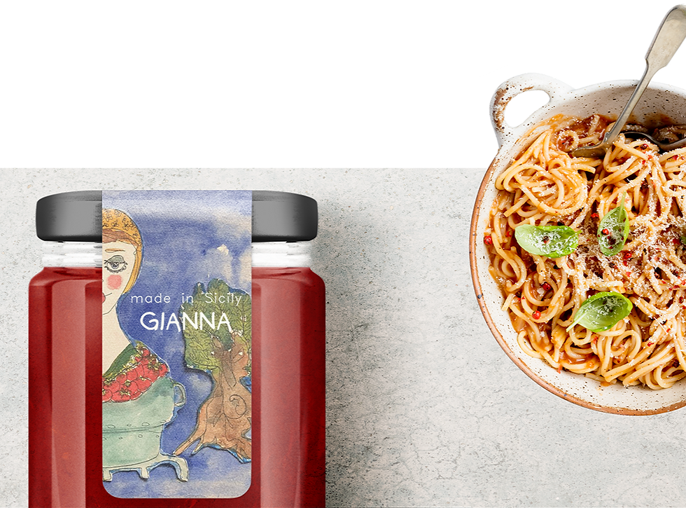
We got to create a flourish brand identity for GIANNA’s new tomato sauce, alongside a complete label and container design.


WE HARVEST - GIANNA | PACKAGING & BRAND IDENTITY
The SOLUTION
Through the Discovery Workshop we identified the key elements the client wanted to incorporate within the general branding and doing this also allowed the implementation of conscious brand strategy principles.
This process helped us with the developing of the brand identity & packaging design, as the visual identity was created from scratch, using our personalized brand creation process. To bring out the vibrant red of the tomato sauce, we designed the brand's visual identity and produced a minimalist label design for the bottles and packaging materials.
The illustration we used in the general branding was incorporated in order to showcase the transparency & authenticity of the brand, telling the brand's story. As the illustration is already rich with symbolism and meaning, we wanted the main brand elements to accompany it with grace and simplicity.
In this way, we were able to encompass the fresh and organic attributes into the finished products.

